
Frequency Response Quiz Answers
Saturday, October 9th, 2010 | by matthew mcglynn
Is it possible to distinguish a mic’s Cardioid, Omni, and Figure-8 frequency-response graphs, if they are not labeled?
That’s the question I posed in the Mic pattern identification quiz. The answer is “yes,” of course, but as is usually the case, simply knowing which is which is not nearly as rewarding as figuring out why.
| Chart A | Chart B | Chart C |
 |
 |
 |
Understanding frequency-response graphs
A frequency-response graph shows a microphones’ output level at various frequencies. These charts are typically made by placing a microphone into an anechoic chamber (an enclosed space within which sound reflections are minimized), and playing a “sweep tone” from 20Hz–20kHz through a speaker placed some distance away from the microphone. The mic’s output level is recorded and plotted on a graph.
In some cases, a second measurement is made after the mic is rotated. This second measurement shows the mic’s response to off-axis sounds. Off-axis sounds are sounds coming from the side, or from behind the microphone.
That’s what we see in these mystery graphs. Each shows two traces. One must be on-axis, and the other is off-axis. We don’t yet know the off-axis direction; common choices would be 90° or 180°.
Notice that in two of the charts, the two traces are close together, if not right on top of one another. This tells us something new: the off-axis direction.
We know that these three graphs represent the mic’s Cardioid, Omni, and Figure-8 responses. In two of those patterns, the mic’s response from the front and back should be more or less identical. So, we can assume that the two traces show the 0° (front) and 180° (rear) response for each pattern.
The next thing to notice is the difference in frequency response from graph to graph. Compare the average dB value below 200Hz for all three graphs. It is lowest (-45dB) in Chart A, and highest (-40dB) in Chart C. This means that the pattern represented by Chart C has about 5dB more low-frequency output below 200Hz. This change in low-frequency response is telling.
Expectations about the microphone
The vast majority of multipattern microphones use dual-diaphragm capsules. Each diaphragm independently produces a Cardioid response. By combining the output of these two diaphragms, the capsule can produce an infinite variety of polar patterns, from Omnidirectional to Figure-8.
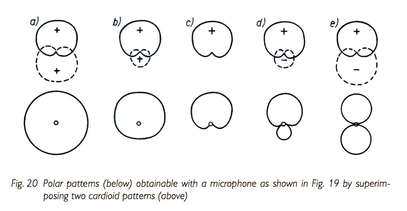 For example, adding the front and back elements’ output at equal gain and polarity yields an Omnidirectional response. By reversing the polarity on the signal from the rear diaphragm, the result is a Figure-8 response.
It is a performance characteristic of dual-diaphragm multipattern capsules that low-frequency response rolls off in Figure-8 mode. This is a result of the short distance between the two sides of a dual-diaphragm capsule. Low-frequency sound waves are so long that the phase difference between a wave striking the front and rear diaphragm is negligible. In Figure-8 mode, the output of the rear capsule is reversed in polarity before being mixed with the output of the front capsule, so these two nearly-in-phase (but polarity-reversed) low-frequency signals cancel each other out when mixed.
(An aside for those of you who haven’t already given up on my attempt at this explanation: increasing the distance between the two diaphragms can improve the capsule’s low-frequency response in figure-8, by increasing the difference in phase of LF waves hitting both diaphragms. See the Neumann KM 86 and JZ BH-1.
See also the Shure KSM141, a multipattern mic with a single-diaphragm capsule. It can change from Cardioid to Omni mechanically, by closing off the acoustic vents behind the capsule.)
Identifying the patterns based on frequency response
We now know enough about how typical multipattern condensers behave to identify all three graphs.
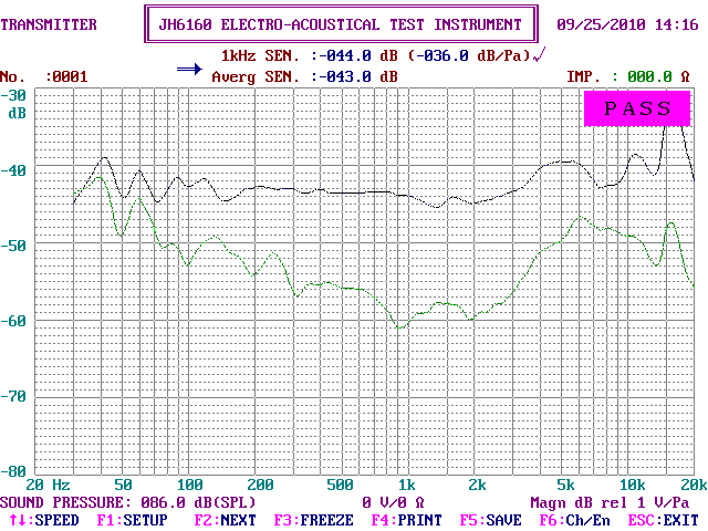
The middle chart, in which the output of the rear side of the mic is up to 16dB lower than the front, must be Cardioid. Note that the two traces converge at low frequencies. Most Cardioid mics become increasingly Omnidirectional — or, rather, decreasingly directional — at low frequencies.
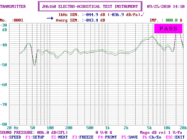
The first and third charts, then, show the mic’s performance in Omni and Figure-8. To figure out which is which, look at the low-frequency output levels. The one with less LF output, Chart A, must be Figure-8.
The order of charts, then, is: Figure-8, Cardioid, Omni.
The Winner Is…
The contest winner, selected randomly from all the correct respondents, is Dan Bronson. Congratulations, Dan!
Dan’s explanation was wonderfully succinct:
Dan Bronson
Chart B is obviously cardioid, because the response from one side is significantly less than the response from the other. That leaves figure-8 and omni. Assuming the microphone was positioned at a distance from the source greater than a foot or so to avoid proximity effect at short distances, figure-8 should show a slight loss of bass (due to the lower frequencies arriving at the out-of-phase diaphragms at the same time, cancelling each other) while omni should give us a more full ‘sonic picture’ with no loss of bass (both diaphragms are in phase, so all frequencies add together). We can see this in Charts A and B respectively.
What about proximity effect?
We don’t know for sure, but it’s reasonable to assume these graphs were made 1m from the sound source. It would be unusual to provide measurements from any closer distance unless the point of the measurement was to illustrate proximity effect.
A couple of the quiz entries picked chart A for Cardioid, citing that bump at 45Hz as “proximity effect.” But that’s not what proximity effect would look like. See the  beyerdynamic TG-X 50 Mk II frequency graph; the line splits below 400Hz. The mic’s response at 10cm is 6–10dB hotter below 70Hz than it is at 1m.
What about the 1/2-dB separation?
Chart A, which we’ve identified as Figure-8, shows about one-half dB difference between the front and back diaphragms’ response. Contrast with the Omni chart, in which the two lines are nearly coincident. What could explain this?
Jean Luc Moncel
The 1st graph indicates a slight difference between front and rear, which is due to the fact that the polarisation voltages are not strictly equal in absolute value, one being positive and the other negative. In the case of omni, both capsules are polarised with the same voltage, making their outputs identical.
Comments & Corrections?
Fire up the feedback form below.
Related posts:

Posted in Microphones | 1 Comment »
Steve Sisler
November 19th, 2010 at 3:33 am
Great sight, great video, great microphone test and explaination!! Whens your next video due?